Trickster is a libre font I released at the end of 2017. When the Velvetyne crew and I published the typeface, I called it “a smooth blend of Merovingian writing, blackletter influences and contemporary shapes”. It’s a smart way to say I don’t know how to label it properly. The design being quite unusual (call it weird or ugly if you want, but at least it’s not your usual Helv) I thought it could be interesting to write about its development and what’s behind its design decisions.

At the beginning
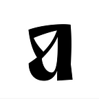
Trickster is born from one of the frenetic pen and paper doodling periods I have sometimes (between 2 periods where I make all my tries on screen). Among the many letters I draw, there was this radical and unusual a. I like it so much I draw it again and again until I switch to the computer and designed the glyph directly with Bezier curves.

This letter was a challenge: how to derive an entire typeface from this atypical letterform? Is it even possible? At this time I looked a lot at a kind of medieval calligraphy called Luxeuil writing (or Merovingian writing). Merovingian writing is quite illegible now because of its many ligatures, forgotten letters constructions, and the use of a writing tool that allow to go back from bottom to top and cause very black stems (you don’t do that usually in calligraphy).


Gessing that the Luxeuil writing I was looking at so fondly may have impact my design, I loosely used some of its shapes and tried to mix them with the a. So my first sketches looked like that:

The g comes from the Merovingian construction, like the o, while the square-alike m and n are influenced by the a. The open head of the g, with the descending end of the loop comes from the writing tool and the need to stop your gesture when writing. I suppose it could be linked to the need of exhausting the ink to avoid stain when lifting the pen to start the next letter. So it’s a calligraphic feature with a reason, however I can’t help but seeing a drop of blood flowing (we’ll talk about it later). The typeface had a Blackletter feeling, so quickly I move to a bolder weight. The lettershape followed the movement and I redesigned m and n in a more classical way. The p, n, m had now a really calligraphic voice. (Yes, the dot on the i is a mess, and curves are generally wrong).

The stems are broken like some Blackletters models, but I suppose Infini — a font I’m really fond of — influenced me too. It’s a feature you could think outdated until recently, but a really good use like Infini showed us it’s still relevant today. So I jump on the train.
I liked the way it looked, so I dug my ideas deeper: I made the weight even bolder and quietly started to make the remaining lowercase and the capitals.

Street Cred

Disclaimer: I’m not a tag addict, I don’t know anything about it (or very little, thanks to my fellow colleague Elliott). But I work in a neighborhood where tags bloom on corner shops. I can’t tell much about this or this tag, crew or style, but I like the gesture, I like the flow — and without noticing it I merged some stylistic elements from the street in my design. It’s obvious in those several versions of the f.

Eventually the second one was kept (and a modified version of the third as alternate).
This f was quite a challenge because it has a lot of white space on its right, and in the same time it blacken the word when kerned to correct this issue. I had to find the right balance.

And it needed some ligature substitution to work properly. Even a i+f+i solution:

Other letters received this kind of street look medication, mostly in alternate shapes; like this creamy/burger s.

The X and x, the alternate k, the s, etc. could be filed in the same design decision: gesture, gesture, from the past and the streets.

K I S S
So tags are a good inspiration, but the typeface needed to work its medieval-ish look (a half serious half pop culture medieval look). So I started to make the uppercase this way.

I was unsure about it: they were fun, but those very calligraphic, lined Blackletter capitals felt too cliché. So I started to doubt and try a more simple design (thanks Jérémy for your input on this topic). I kept the structure, but cleaned the design (see the A). I added spikes to ornate the stems a little, and used my tag trick to make them bouncing (upper diagonal of the K). The O and Q are a good mix of calligraphic/tag/simplification solution. Even P, X, V, U try to retain and share the gesture in a half calligraphic half contemporary way. To me the S with its curvy loopy movement has a really street structure. The M has a fun design, looking like the signature of a comics super-villain.

It helped me to better understand what Trickster wanted to be: a blackletter for the 21th c. So I started to simplify and clean the lowercase too, but without loosing the warmth and the softness of the calligraphic gesture.

The a is a good example: it looses its inner upstroke which simplify the shape, and also gives it a more contemporary voice (the inner counter is very graphic). But if you look closely you see that the down upstroke that ties the bowl to the stem keeps a calligraphic style (and so the attack of n, m, p). In the same time, letter like c could be seen as oversimplified compared to letter like p. The c is indeed very geometric (look at the white counter) but you can still see the gesture, so the words can flow when mixing all the letters together.

Drip, drip, drip
I told you about the Merovingian g. I liked its dripping open head, so I have repeated this feature on some other letters, like r. (The f kind of relate even if it came more from graffiti and was influenced by a medieval weapon.) The r goes beyond the xheight because Merovingians did it, and it add rhythm to the text. It is an interesting shape, but it kind of touches everything to avoid white holes and therefore create black spots when merging with stems on the right. You could rage about it, but to my eyes it makes original patterns so I kept it this way.

Still, it doesn’t added as dripping feelings as I wanted, so I made alternate letters and go berserk.

It’s just 5 letters (barely since it impacts the alternate s) but it changes a lot any logo or text set with Trickster.

In addition to this bloody stylistic set, I put some fancy stuffs, like this long tailed y that can go beyond left letters only if they don’t have descendant. And a swash e. And alternate letters. Search in the OpenType features of Trickster, you’ll find things to spice up your design.

Go figure
Figures were another struggle, similar to capitals. I made several attempts with useless ornamentation and oddities. But I wasn’t convinced.

Following the uppercase design, I choose a sharper approach. See how the 2 makes a loop creating a geometric shape. The 6 and 9 mix a no-contrast style and contrasted elements. When I found the right formula, they were easy to draw. Then I adapted them into old style figures.

The punctuation was a fun thing to do. I started with a diamond-shaped dot, derived the comma from it and it was working immediately. The ? followed the style of the 2. And finally the hyphen is like a frenetic gesture that looks more like a scratch — and it fills well the space.

For the quotes I didn’t reuse the comma as it, but make them turning more and changed the starts to make it round (better integration with the words in the sentence).

Finally, the more decorative stuff like &, ¶, % were easy=)

End of the journey
If I need to resume: Trickster is a Blackletter for tomorrow. But to promote it today, we made a poster exhibition showing creations from 14 designers who played with Trickster. I did one and mused with my font to create an original lettering. Since Trickster is a libre font you could do it too.

Thanks for reading. And use Trickster, it’s free.